Solutions
Securely accept, manage, and make payments through one point of integration


How does a company update its look to better reflect its identity and ambitions?
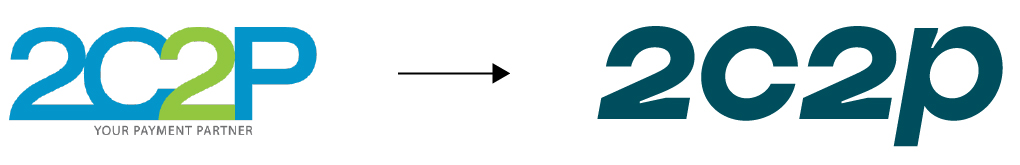
When 2C2P first shifted to a new logo in 2020, our aim was to project boldness, confidence, and continuous movement: a reliable payment services provider that large enterprises could trust to take their business further.
This brought the company’s image into better alignment with its position as the preferred partner for airlines, online marketplaces, and other enterprises operating across Southeast Asia.
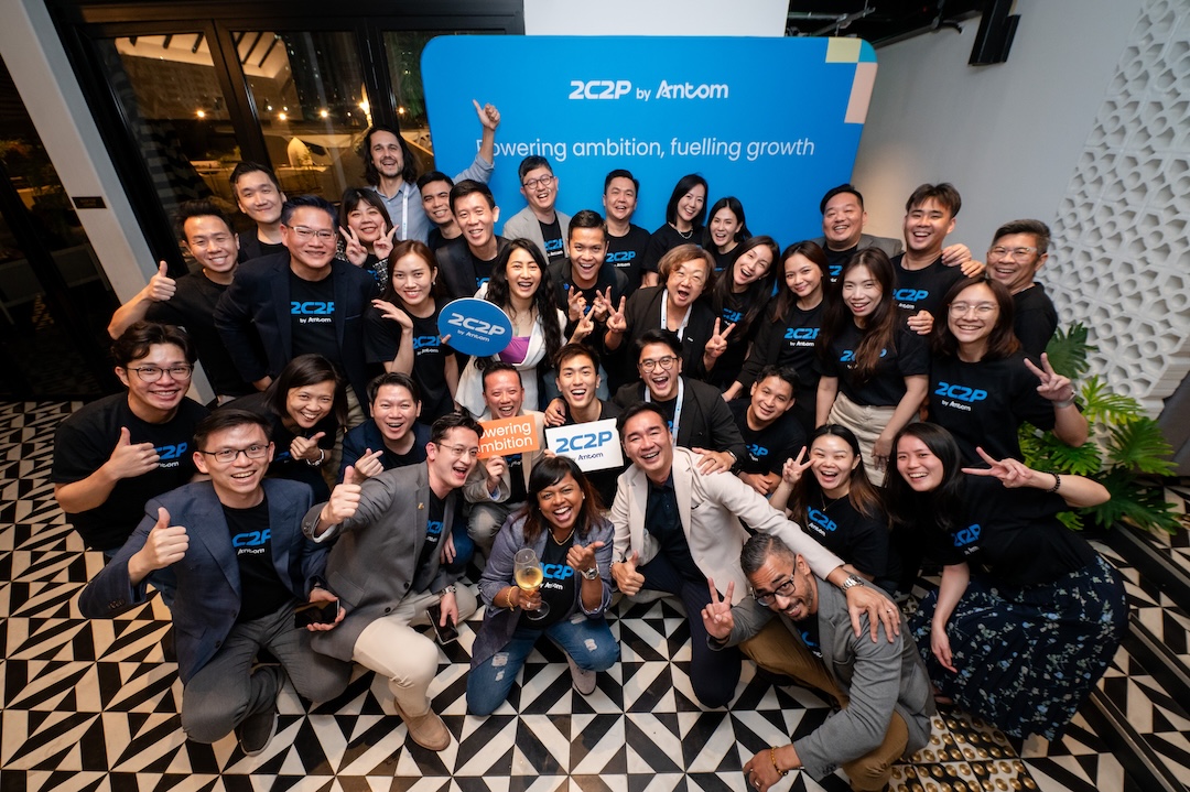
But in the payments world, 2C2P has to keep the momentum going. In the years since, we’ve continued making bold moves, from forging strategic partnerships to developing new products like 2C2P softPOS, to adapt to new technology and merchant needs. These efforts have enabled us to explore new ways to grow beyond our established niche, and we have since welcomed new leadership to help chart our next steps.
It was time to ask: What does the future of 2C2P look like?
To answer this question, we started with our new business direction.
Our Chief Executive Officer-elect, Khun Worachat Luxkanalode, had broken this down into three key pillars:
2C2P’s next chapter, then, would be defined by inclusivity, innovation, and expansion. From there, the design goals became clear. We needed a fresh visual identity that could:
One of the biggest challenges with any brand refresh is managing the extensive associations, applications, and equity that a brand has accrued over the years.
In our case, this meant navigating considerations and requirements from multiple stakeholders. Aside from our design goals, I had to account for a wide range of factors, from the display specifications of various channels that featured our logo to regulatory guidelines on how companies like ours could present ourselves to the public.
For instance, as Antom’s Southeast Asia arm, it was important for us to build stronger synergy with our parent brand while retaining our distinct visual identity and brand equity. Our team worked closely with the branding and design teams at Antom and Ant International to ensure that we achieved this.
Balancing these considerations was a good reminder that brands don’t exist in a vacuum. Ultimately, branding is not just a question of graphic design, but an exercise in thinking deeply about how visual elements can serve various needs and goals across an organisation’s operations.
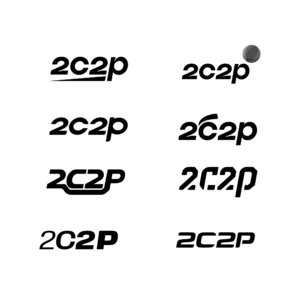
Our refreshed branding had to feel new, but not unrecognisable – especially to our existing merchants and partners. With this in mind, I explored multiple avenues for updating our logo, from making subtle changes to brainstorming entirely new designs.
 |
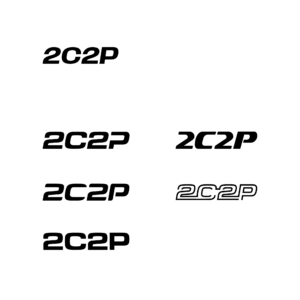 |
Eventually, we landed on a design that met all our requirements:
![]()
The new logo is sleek and dynamic, leaning towards a futuristic style that calls to mind technology and innovation. Putting all the letterforms on an even, flat baseline makes the logo look more stable, communicating a strong foundation. At the same time, it creates a more rectangular, geometric outline that is much easier for the eye to recognise.
I’ve also hidden an easter egg: Sharp-eyed audiences may notice that the “C” and “2” resemble a carabiner, a tool used to secure climbers’ weight and ensure their safety. This reinforces the idea of security and reliability, and of 2C2P being businesses’ trusted partner to support their ascent.

Colours play an important role in evoking specific emotions and perceptions that a company wants its brand to convey. Each colour has associated meanings, so building a brand’s colour palette is all about selecting hues that communicate the right messages.
For the logo, I selected light blue. The brighter hue feels youthful and energetic vis-á-vis our old logo’s solid dark green. Blue also evokes technology, dedication, and being calm and collected – the perfect colour to reinforce our image of being innovative and reliable. It also deepens the visual association with our parent brand Antom, who shares the colour in their palette.
Once the logo colour was set, the rest of our colour palette fell into place. To symbolise our renewed energy and direction, we needed similarly bright, complementary colours that would help our logo pop.
I chose warm colours like orange and yellow that express joy, optimism, and new beginnings. To ensure versatility in our design options, I also included cooler-toned colours like coral blue and purple that are associated with renewal, creativity, and ambition.
![]()
Beyond the core branding elements, we also selected a new font. Poppins is a geometric, minimalist typeface that embodies youthful energy and approachability. It’s also the main font for our parent brand, ensuring greater synergy in how our brands communicate with audiences – literally!

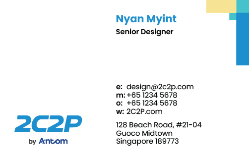
To complement our core branding elements, I created an additional arrowhead symbol that can be used for collaterals like namecards and document templates.
It’s built out of squares and rectangles to reference pixels, serving as a subtle nod to the digital aspects of our business. It’s always placed on the upper right corner of collaterals so that the arrow points up and forward, symbolising progress.
 |
 |
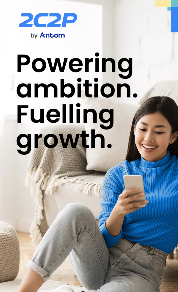
Overall, our new branding system has proven to be quite versatile. As a company that operates largely in digital spaces, small-scale applications like thumbnails and logos are quite common. Our new logo’s rectangular outline and cleaner shape stand out in these settings while still performing well in large-scale applications like banners and event displays.
Our brand refresh was not just another design project – it was an opportunity to convey what 2C2P has grown into and where we’re headed next. I’m proud to have steered the creative process, depicting our next chapter with creativity and strategic clarity.